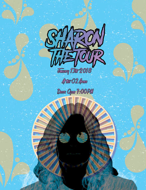
Sharon the Tour Poster
|
For this project, we were able to make a tour poster for Ozzy Osbourne. We began the process by colouring the background with a bright cerulean blue. We then used a stock photo of Ozzy and turned it into a transparent using the lasso tools. Then, we used the different laying of difference and it completely changed his colour scheme. After creating a new layer, we added a shape, colouring it orange so it complements the blue. We wanted the shape to look like some sort of halo, while also appearing on his glasses for a surreal affect. We also added a drop shadow and coloured it light pink to create depth on his halo. Next, we put another layer underneath of a paintbrush in which we coloured orange. It complemented the background and gave the poster more substance while still being subtle. We also added another paintbrush layer to make the poster appear vintage and grainy. The last paintbrush we added was smoke onto the bottom of Ozzy. We wanted to create some texture on his jacket. Lastly we added font, explaining the tour name, date and arena. We named the tour "Sharon the Tour" after being inspired by a hilarious impression once seen on a Disney channel show. The font was selected from the horror section, but it gives a rock and roll vibe for the tour. We customized the gradient on the font using pinks, blues and purples and selected it to be linear and added stroke to the outline to make the title pop out. Overall, we wanted to make the tour poster look psychedelic with the patterns and shapes while still keeping the rock and roll vibe with the fonts and textures.
|
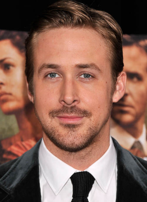
Ryan Gosling
|
|
We took a stock image of Ryan Gosling and used photoshop to enhance his image so he's ready for any magazines or features. First, we resized the image so it fit the paper with the fill button. Then we made a duplicate copy of the original and wanted to create more symmetry in his face to appear more attractive (if that's even possible). We used the circular marquee tool to select his left eye (it was more attractive) and selected via copy. It duplicated the space of the eye that we selected, so then we flipped the eye and moved it over the right to make both eyes symmetrical. We then used the eraser tool with a brush that had faded edges to erase and blend the harsh lines with the rest of Ryan's face. We repeated this step with his nose using the left side, his eyebrow with the left side and his mouth using the right side. It achieved the symmetry that we wanted. After blending all the harsh lines out, we then did a skin edit on Ryan's face. After adding another layer we used the heal tool with an opaque brush to remove any unwanted blemishes such as pimples, moles, scars, and blackheads. Next, we used the mask feature, we filled the added layer with black and used the white brush. We used the blur filter on him, and by using the white brush we were able to uncover the blur and improve the look of his forehead, nose, chin, and cheeks, (white reveals, black conceals). By doing this it created an even base. At this point his skin was near perfect. But, his features needed some improvement so we created another layer labeled liquify. We used the liquify filter to widen his eyes, plump his lips, slim his nose, and slim his face. After, we did an eye edit. We created another layer and colourized it to a light, yet natural hue of blue. Once again we used the mask tool (white reveals, black conceals), filled the layer with black and used the white brush to reveal his new eye colour. Sometimes if we made mistakes we would use the erase brush. Lastly, his skin was looking a bit washed out and dull so we created a contour and highlight layer, filling the layer with grey. We then selected the blend mode to soft light and then proceeded. We used the burn tool at a very translucent percentage to not go overboard and a brush with a lot of feather. His cheeks, forehead, and nose were contoured, and the pupil of his eyes were darkened with the burn tool. Then, we used the dodge tool and highlighted his cheekbones, middle of his nose, cupids bow, shine on his lips, brow bone, and the highlights in his hair. Lastly, we merged all layers together and created an editorial-model-in-vogue edition of Ryan Gosling.
Print Ad Inspirations
|
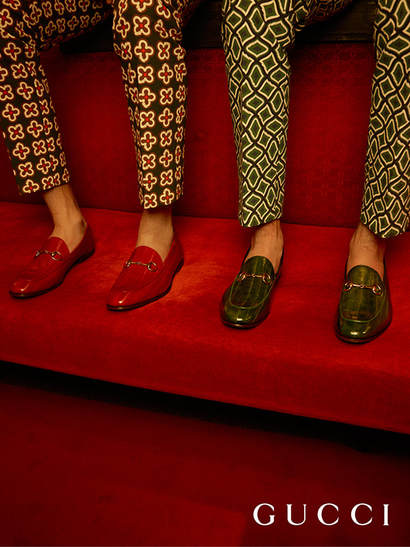
I adore this print ad because Gucci introduced their new shoe campaign with their new creative director, Alessandro Michele in which ties in with their new version of Gucci. Their new vision of Gucci is full of floral patterns and eccentric styles. I love how the models bottom half of their legs are shown to focus on the shoes. The models are also dressed in Gucci's latest season of clothing which matches the setting and is overall a pleasing colour scheme. What edits that were made in photoshop was the skin edits made on the models using the heal tool and blur tool. Another tool they could of used was dodge to highlight certain places on the models and the shines in the shoes to make them appear clean and crisp. The burn tool was also used to improve the darkness of the shadows and dark hues in the pants. They also could of used a colourize tool to brighten and saturate the red cushions in the photo. The text font tool was also most likely used to used the font and create the Gucci title.
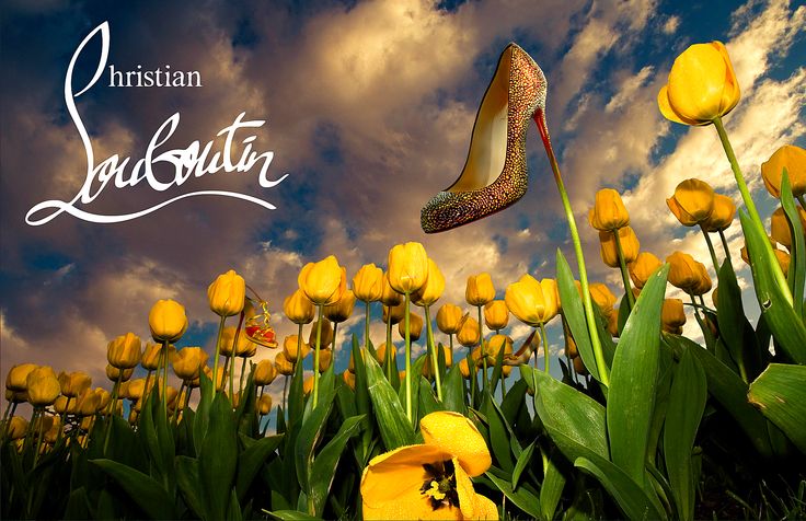
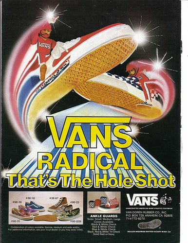
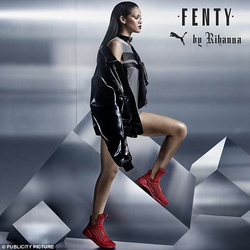
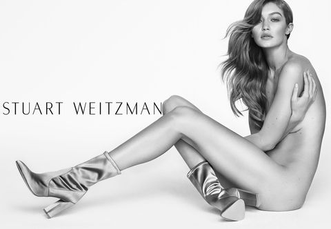
I choose this ad because I love how it incorporated designer shoes with humour and clever advertising. It simply markets the shoe as beautiful and delicate like a flower, therefore it's grown like one. The text photoshop tool was used for the Christian Louboutin font. The background of the sky may have been colourized and liquified to achieve the desired shape of the clouds. The shoe was turned into a png using the marquee or lasso tool and placed onto the image. The editors could of blended the stem and the heel together using the liquify tool and eraser. The colours of the flowers and stems could of been colourized using saturation. The dodge tool also could of been used on the heels to make it more sparkly and bright alike most jewellery companies market. I love this print ad because it's truly eye catching and good for their target audience. The marketing for this ad is great and it brings a lot of attention to their shoes. A tool they could of used is the lasso tool to crop the shoes out to create a png and paste it onto a plain background. They used the text tool to create their clever slogan and their "Vans" logo. They text they included is also used to describe and give more information about the shoes. They also inserted a picture of the other styles of vans to appeal to a greater audience and give variety. They also used a png of the people riding the shoe to paste onto the top of the shoes. Another tool used is the liquify tool to give the appearance of the shoes flying or being distorted and blending the action lines. A brush was also used to create the large shines seen in the photo. Lastly, a drop shadow or stroke tool was used to give the main text a 3D appearance. I love this ad because it captures a successful woman modelling her own clothing line. Rihanna's pose appears fierce and strong, while still marketing the shoes well. The text tool was used to create the "Fenty by Rihanna" text using various fonts and adding the puma logo. Rihanna was also created into a png to be placed in the ad using the lasso tool. The background could of been created with the use of illustration tools and shapes, while colourizing the hues grey. Many dodge and highlight tools were used to achieve a glossy appearance on the jacket, glow on her legs and cheekbones and shoulders, and faint shine on the background. The saturation filter may have been used to brighten the red shoes, making them the focus of the add and more eye catching. Lastly, skin filters such as heal tools were used to create an even smooth complexion on her legs, shoulders and face. The burn tool could of enhanced her lash line, eyebrows and heavy shadow in her contour. Lastly, the liquify tool could of been used to make her body look slimmer and legs look longer, (even though she doesn't need it). I enjoy this ad because it's simple, elegant, and eye catching. The model looks very natural and bare, which helps bring attention to the shoes so it's the centre of attention. A plain white background was used to fill the page. The text tool was used to create font and brand logo of "Stuart Weitzman". Many skin edits were done to this ad to improve the look of the model such as the heal tool to get rid of unwanted spots on the model's face and body, the burn tool to enhance her natural contour in her face and makeup, and the shadows on her body and the shadows on the shoes. A dodge tool was used to create highlights on the body, face and shoes to create contrast of the black and white ad. The erase tool could of been used to get rid of any unwanted fly away's in her hair to make it appear tame and flawless. The liquify tool could of also been used to morph the models body to appear longer and thinner. Lastly, a drop shadow was used to create depth in the advertisement. |
World's Raddest Shoe Print Ad
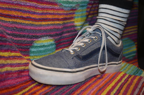
|
My goal for this shoe ad was to catch the audience's attention while still putting out the Vans skate culture vibe and creating a pleasing-to- the-eye advertisement. I started from scratch by working with this photo I took of some "low top old skool" vans that were navy and were photographed at an angle in which detail was shown. First, I created a new document which was 8.5 by 11. I then created a png out of the shoe by using the quick select tool to get rid of the unwanted background. For harder areas to erase I used the lasso tool to get as close as possible to a clean cut edge. This was the most difficult step because I wanted it to appear as straight as possible. Next, I pasted it onto the document. I flipped it around and resized it. Then, I created another layer which would be my background and found a pattern to use that was busy but it didn't take the attention away from the shoe. The pattern resembles some sort of static or houndstooth print in black and white. I decided the ad needed more attention so I used a colour blocking technique. I created squares using the shape tool and coloured them a bright red. Two went diagonal to the shoe and one helped emphasize a logo I would later add. I placed this layer under the shoe layer. Then, I wanted some dimension in the ad so I used the drop shadow and filled it to a 75% opacity to make it appear less dark but enough so it stood out. I applied this to the shapes and the shoe. I also applied bevel and emboss onto the shoe layer to draw more attention to it. I kept the blend mode at normal for all layers so far. Then, I decided I wanted the Vans logo to be subtle but still eye catching so I copied and pasted a png of the Vans logo onto another layer. I loved the look of the logo to appear almost translucent so all layers underneath would shine through so I placed the blend mode as hard light. I wanted it to also appear 3 dimensional so I applied the drop shadow effect and bevel and emboss effect. This created texture and made it stand out. Next, I downloaded two different fonts from dafont.com. I wanted it to have a skater vibe so I went with the fiery font as my slogan. I incorporated skateboarder culture and the type of vans shoe into my slogan which would later become "Go Old Skool With the World's Raddest Shoe." I adjusted the size and later added a curve to the font and tilted it at an angle to cover more space. I added effects such as drop shadow, inner glow and bevel and emboss to create depth and helped it stand out. I also wanted to have another logo at the bottom corner because in many ads they add small logos there. I copied and pasted another png of another version of the vans logo and added effects to it such as drop shadow, outer glow, and bevel and emboss to give it texture and shine. Lastly, I used a retro font to emphasize that vans were created in 1966. So I added " Since 1966" and added the same effects. Overall, I am happy with my print ad because it corresponds with the Vans brand and it brings attention to the product I'm selling.
|
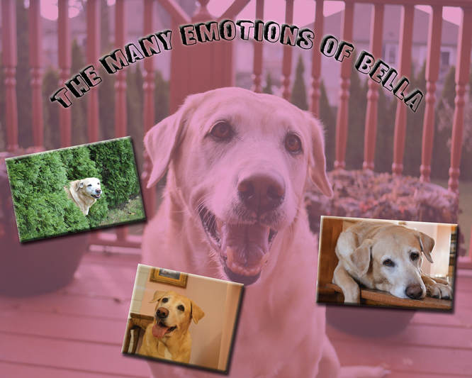
The Many Emotions of Bella - A Multi Layer Image
|
The goal for this project was to create a multi layered image where we incorporated the photos we took of our pets. I started off by filling the background with a pastel pink colour. Then I placed the first photo of Bella after editing it in light room as another layer. I changed the blend mode to hard light which gave me this muted pink effect overtop of my dog's photo. This was a nice base to start off with because it gave the image a pop of colour while still keeping it neutral with the muted pink. Next, I placed three more images of my dog, in which were previously edited on light room. I resized the photos and tilted them as well. I scattered the images to create some sort of mismatched collage that went with my playful/pet theme. After I choose one of the photos to add effects to it. I added a drop shadow and bevel and emboss to increase the depth of the images and give it a 3D effect. Next, I placed an inner shadow to give it a shine effect. I copy and pasted these effects to the remaining two images. Then, I came up with a theme. My dog is very expressive so I wanted the theme to showcase that, hence the "Many Emotions of Bella" title. In the background photo she's very happy and smiley. In another, we see her with a grim expression and so forth. I choose a font from dafont.com that suited a fun, playful vibe that animals usually bring. I used the text tool than resized it and gave it a drop shadow to increase the depth. I then used an outer glow to make the title stand out. Lastly, I used the warp tool to place an arch underneath the text.
|
