|
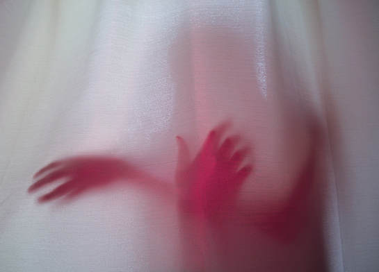
This week's assignment was to photograph shadows. There was no sun all weekend, so we got creative. We shot under curtains to produce shadows and used different objects such as a blank CD, or pink post-it notes and held it to the flash to create colours and make the pictures less bland. I adjusted the photo at the sides to make it symmetrical and cropped it at the top to give less headroom. I then white balanced and lens corrected. I then cooled the temperature to -15 to whiten the curtains because in the original, they were a cream colour. Then I increased the contrast by +1 to create more depth in the shadows. I highlighted to +36 to make the curtains appear brighter and decreased the shadows to -30 to make them appear more prominent. Lastly, I adjusted the whites to +38 to make the curtains a brighter and crisper white. I left the pink alone because it was already saturated enough.
|
|
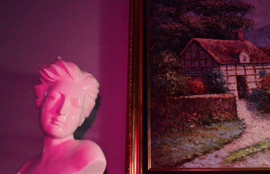
For this photograph, I shown a very bright lamp onto the statue's face to create shadows and defined it's face. I cropped it at the sides to create symmetry and the bottom so the cloth underneath the statue wasn't shown. The I white balanced and lens corrected. I adjusted the temperature to -20 to make the photo appear more magenta than it's original. I then highlighted to +12 to whiten the statue and the whites in the painting. I then increased the shadows to make the statue's face shadows appear more prominent. I increased the whites to +12 to make the statue a true white and the blacks to -2 to make the shadow behind the statue richer. Lastly, I adjusted the clarity to help make the grain in the photo appear smoother and the overall photo clearer.
|
|
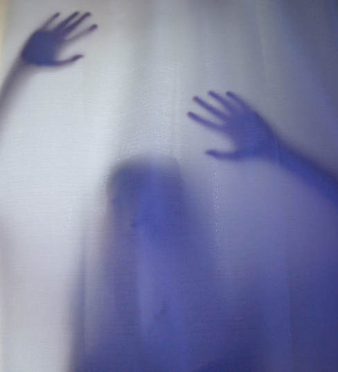
I chose this photo because it has a sense of mystery and I enjoyed how the blank CD tinted the shadow purple. I cropped this photo at the sides to get rid of unwanted curtain and to focus the image on the shadow. Instead of white balancing, I just edited it myself because the photo would end up a very warm temperature and it would lose the purple hue. I lens corrected and then I cooled the photo to -8 to enhance the purple and blue colours. I adjusted the exposure a tad to +0.20 to lighten up the curtain colour. Then I adjusted the highlights to +17 and whites to +15 to make the curtain a crisper and brighter white than the original beige fabric. Then, I decreased the shadows to -19 to bring out the appearance of the shadow more and to darken the hue. Lastly I increased the vibrance to +6 to give the shadow a deeper purple tint.
|
